5 key practices for data presentation in research
February 3, 2025
By Catherine Renard, PhD, HDR

Dr Catherine Renard is a Director of Research at the at the French National Research Institute for Food, Agriculture and the Environment (INRAE) and Editor-in-Chief of LWT – Food Science & Technology.
Even before you embark on your experiment, it’s essential to think strategically about how you will analyze and present your data.
In the world of scientific research, presenting data clearly and accurately is crucial for advancing knowledge and ensuring the credibility of findings. Here are some recommendations on how to analyze and present your data effectively to produce better articles and improve their usefulness to the community.
Editor’s note: In this article, Dr Catherine Renard highlights key principles from her article Good practices for data presentation in LWT – Food Science and Technology opens in new tab/window.
1. Plan ahead for data exploitation.
Before embarking on experiments, it’s essential to think strategically about how you will analyze and present your data. Consider the hypothesis you want to test and choose the appropriate statistical tools accordingly. By planning ahead, you can ensure that your data analysis aligns with your research goals and objectives.
Planning ahead also involves considering the potential implications of the data and how it can contribute to the broader scientific knowledge base. Think about the specific questions you want to answer with your data, and make sure your analysis methods are tailored to address these questions effectively.
By setting clear goals and objectives for data exploitation, you can streamline the analysis process and avoid unnecessary complications or misinterpretations down the line.
2. Choose statistical tools wisely.
“Statistics are good servants but poor masters.”

CR
Catherine Renard, PhD, HDR
Director of Research, French National Research Institute for Food, Agricultural and the Environment (INRAE) | Editor-in-Chief, LWT – Food Science & Technology
Selecting the right statistical tools is crucial for conducting robust data analysis and drawing meaningful conclusions from research findings.
Start by identifying the hypothesis you want to test and then choose the statistical methods best suited to address that hypothesis. Avoid blindly applying statistical tests without considering the underlying assumptions and limitations of each method.
One common pitfall in data analysis is the overreliance on statistical significance as the sole criterion for interpreting results. While statistical significance is important, researchers should also consider the practical implications of their findings and whether the observed differences have real-world relevance. Analytical replications are not sufficient: You need replications of either the raw material or the actual process, depending on your aim.
In food science, for example, you should take into account the intrinsic variability in the agricultural raw materials. Indeed, sampling usually is the main source of variability, much above the analysis itself. Theory of sampling (TOS) may be arid, but it is essential for quality results. What did you do to ensure that you had a representative composite (not grab) sample? Are the phenomena you are going to observe large enough to be of practical significance, or will they just be “noise” swamped by the differences between batches? In many cases, this means that raw material replicates may be needed, or process replicates. Typically concluding on “significant differences” when there are only analytical replicates is usually of little relevance and typically overinterpretation of results.
“While statistical significance is important, researchers should also consider the practical implications of their findings and whether the observed differences have real-world relevance.”
CR
Catherine Renard, PhD, HDR
Director of Research, French National Research Institute for Food, Agricultural and the Environment (INRAE) | Editor-in-Chief, LWT – Food Science & Technology
In addition, in my experience as Associate Editor for LWT – Food Science and Technology opens in new tab/window, I have encountered many instances where an inadequate tool was used or where data was globally overinterpreted, some verifications were missing, etc. In many cases, the authors may have followed what they saw in other papers or used the methods proposed by software tools without questioning their adequacy. They may also have been taught with an operative rather than reflexive point of view, with a focus on tools and how to calculate rather than why and the underlying assumptions. In some cases, cutting corners and bad faith might have also been at play.
Statistics are good servants but poor masters. There are two things that can be done using statistical tools:
Descriptive statistics involves summarizing the data to enable a better understanding of the data. Common tools include the various types of average (mean, median, mode) and description of distributions (frequency, box plots, etc.) as well as visualization tools such as principal component analysis.
Inference testing opens in new tab/window involves data analysis using a sample to make conclusions about the underlying probability distribution of the population from which the sample was taken or estimating values from the population. It is notably used to infer statistically significant differences by calculating confidence intervals. It is typically the domain of ANOVA (Analysis of Variance) and the commonly used statistical tests such as Tukey’s Honest Significant Difference and Student’s T test, which assume a “normal distribution” of the data (i.e., Gaussian) and independence of samples.
By critically evaluating the available statistical tools and selecting those that are most appropriate for the research question at hand, you can ensure that your data analysis is rigorous and meaningful.
3. Do not assume “normal” data distribution or the independence of samples.
There are two key stumbling blocks here.
The first is that the number of individuals is low for inference testing: Assuming that a distribution is “normal” or nearly normal can only be verified reliably for large populations (a small population for a statistician is about 30 individuals). Many articles use tools built for “normal” and large populations but use only triplicates.
The second is the assumption of independence of samples, as requested in classical ANOVA. This is a very poorly understood concept. Independent samples are chosen randomly so that observation of sample A does not depend on the observation of samples B or C. This means that if samples A, B and C are measured at different levels of a continuous variable, they are by definition dependent. There are specific tests for dependent data (ANOVA with repeated measures).
However, if you do measure samples at different levels of a continuous variable such as time, pressure or temperature, this generally means your initial hypothesis is that there is a relationship between this input variable and the observed phenomenon. In such cases, models rather than statistics should be used: for example, kinetic models if time is the input variable, or diffusion models.
An example for the conceptual difference would be using the number of aphids on rose bushes in a garden. If I measure the contamination and compare it to that of my neighbor’s roses, the gardens can be considered as independent samples. However, if in taking the same rose bushes I introduce a parameter such as distance from the road or age of the garden, then the rose bushes are not independent any more; they are connected by this “distance” or “age” variable.
Further, many authors consider p <0.05 to be a deciding level to assess significance of differences. This is a very dangerous assumption. By rejecting the null hypothesis, all you should conclude is that there is a scientific basis for the belief that there is some relationship between the variables and that the results were not due to sampling error of chance. You have not proven that parameter A determines response B — only that it might. There are two key reasons for this:
The p-value is actually qualitative, and its real value should be given in tables (together with the F-value, which reflects the impact of a parameter on the measured variable).
By focusing on rejecting the null hypothesis, the authors forget to consider the false discovery rate, which increases exponentially with the number of measured variables.
4. Be mindful of how you present your data visually.
Effective data presentation is essential for communicating research findings clearly and concisely to a wider audience. Visual representations such as graphs and figures can provide valuable insights and convey complex information in a more accessible manner. Pay attention to the distribution of your data and consider alternative distribution models beyond the assumption of normality. Different data distributions may require different analytical approaches, and visual inspection can help you identify potential outliers, trends, or patterns that may influence the interpretation of results.
When exploring data visually, researchers should pay attention to the distribution of data points and consider alternative models beyond the Assumption of Normality opens in new tab/window.
When presenting data, consider the type of graphs, charts and figures that best represent your findings in a visually engaging and informative manner. It’s important to choose the types of graphs that align with the underlying data structure and convey your message accurately.
Each type of graph has underlying assumptions, and these should be kept in mind when presenting the data, notably to make it immediately clear whether data are dependent or independent.
An example of the difference between an independent and non-independent series of data can be found in Figure 1 opens in new tab/window.
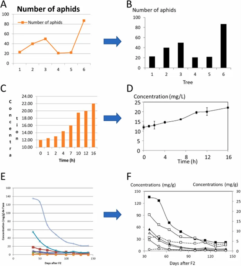
Figure 1. Examples of data presentation. The graphs on the same line contain the same data. Panels A and B: Number of aphids on trees; the trees are independent and should not be connected. A bar graph is appropriate here. Panels C and D: Presentation of a time course; the data are not independent and should be connected; an X–Y graph is appropriate here. (Source: Catherine Renard: Good practices for data presentation, LWT – Food Science and Technology, March 2021)
Data in panels A and B are from independent experiments. They would still make the same sense if the numbers of the experiments (the trees) were changed. Experiments in panels C and D are not independent: They only make sense because they are ordered along the time course. There are specific statistical tests for repeated measurements which are adapted to these types of data sets. However, in such cases, efforts could better be dedicated to identifying the underlying pattern and evolution trends, not comparing the samples. This also has consequences in terms of experimental organization: Acquiring points at more values should be prioritized over acquiring replicates.
In particular, a bar chart opens in new tab/window (panel B) implies that the different points are independent. If your X-values are a continuous variable, then you should not use a bar chart but a line graph.
Line graphs opens in new tab/window (panels D, E or F) allow you to show how changes in one (input) variable affect the measured variable; this is done using points connected by line segments to demonstrate changes in value.
To depict how a model may fit the actual data, it’s best to plot the real data points and superimpose the model. This can be refined by plotting the “residuals” — the difference between the measured points and the model values at the corresponding input variables. “Residual” graphs are particularly useful to compare models: Beyond the R2 value, an appropriate model should have a random distribution of the residuals: Clear trends instead of this random distribution indicate the existence of a phenomenon not taken into account in the model.
Pie charts opens in new tab/window (and more generally two-dimensional pictures) are especially tricky and should never be used to compare both distribution and amount. There is no good choice opens in new tab/window — one that is immediately understandable by the reader — when representing an increased amount by a surface. If the radius in a pie chart is doubled, the surface is multiplied by 4, and vice versa: If doubling the surface, the radius should be multiplied by 2, which may not convey as strongly the meaning of the authors.
Data is often assumed to follow the binomial or normal distribution, but this may not always be the case. Representing data using a mean and standard deviation implies a normal distribution, which can be misleading if the data does not conform to this assumption. While presenting the entire distribution of data may be cumbersome, violin plots or box-and-whisker plots offer a useful compromise by providing a visual representation that can quickly reveal skewness or outliers.
Furthermore, it is crucial to ensure that graphs remain legible even under suboptimal reading or printing conditions (compare panels E and F). This includes avoiding reliance solely on color differentiation, as many readers may print articles in black and white, and considering that a significant percentage of individuals, particularly men, are color blind. Additionally, attention should be given to the size of labels, the thickness of lines, and other design elements to enhance the readability of graphs (See Figures 1E and F above).
Finally, it is important to note that many commonly used spreadsheet programs are not specifically designed for scientific work, and the default graph types they offer may not always be the most suitable for presenting scientific data effectively.
Researchers should also pay attention to details such as decimal precision, table format and color space to enhance the clarity and readability of data presentation. By organizing data in a logical and visually appealing manner, researchers can make it easier for readers to interpret and understand the key findings of the study.
5. Consider your audience
Always keep your potential readers in mind when organizing and presenting your data. Aim to make your research findings as accessible and engaging as possible by using clear and concise language along with visually appealing tables and figures.
Understanding the background knowledge and expertise of the target audience can help you determine the level of detail and complexity that is appropriate for data presentation. By considering the needs and preferences of your audience, you can ensure that your research findings are communicated in a way that is engaging, informative and easily understood.
Conclusion
Effective data presentation is a crucial aspect of scientific research that can significantly impact the credibility and impact of research findings. By following these tips for data presentation, you can enhance the clarity, accuracy and accessibility of your research findings, ultimately contributing to the advancement of scientific knowledge and the broader research community.
Contributor
CRPH
Catherine Renard, PhD, HDR
Director of Research, French National Research Institute for Food, Agricultural and the Environment (INRAE) | Editor-in-Chief, LWT – Food Science & Technology
Read more about Catherine Renard, PhD, HDR